
Grid or slider? Choosing a layout for the Instagram feed on your website
The same posts can feel very different as a grid or as a slider. Here is how to choose, and how to set the number of posts and columns.
Updated October 12, 2026
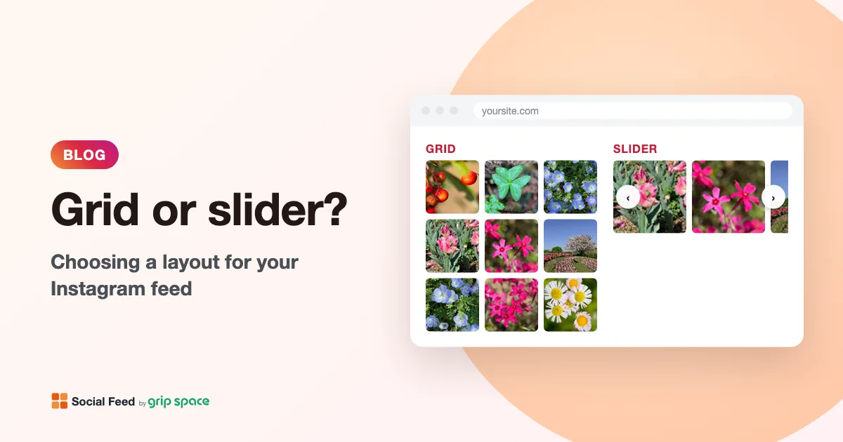
Grid: show many posts at a glance
A grid lines up your posts in rows, like your Instagram profile. Visitors see many posts at once without doing anything, which works well when the photos themselves sell: products, food, interiors, portfolios.
Grids work best where there is room to scroll: the bottom of the home page, an “Instagram” or gallery page, or above the footer. With many posts, the grid becomes tall, so choose the number of rows you want to show (for example 2 rows of 4 posts = 8 posts).
Slider: one row that visitors can scroll
A slider shows your posts in a single row. Visitors swipe on a phone, scroll sideways or use the arrows to see more. The slider loops: at the last post, the arrow goes back to the first.
Because it takes up only one row, a slider fits between other sections of a page, in a narrow column, or on product pages where you do not want the feed to push the content down.
Which one should you choose?
- Choose a grid if the feed is a main part of the page, or if you want visitors to see many posts without clicking.
- Choose a slider if space is limited, or if the feed is a small extra on a page with other content.
- Not sure? Try both in the preview. In Social Feed by grip space, you can switch the layout at any time, and the change appears on your site without changing the embed code.
How many columns and posts?
On a full-width section, 4 to 6 columns usually look good on a computer. In a narrow column or sidebar, use 2 or 3. The number of posts you can show depends on your plan: up to 16 on the Free plan, 30 on Light and 50 on Standard.
You do not need a separate setting for phones. The widget looks at the actual width of the space it is placed in, and uses fewer columns when each image would get too small (under about 100 pixels wide). So a 4-column grid in a sidebar or on a phone automatically shows fewer columns.
Other settings worth checking
- Spacing between images, and the maximum width of the widget.
- What happens on click: open the post larger in a lightbox (with its caption and number of likes), open it on Instagram, or do nothing.
- Account info and follow button above the feed, to turn visitors into followers.
- Videos and carousel posts: choose whether to include videos, and whether to show only the first image or every image of a carousel post.
All of these are set in “Settings & preview” in the dashboard while you watch the preview. To put the feed on your site, see the guides for WordPress and Shopify.
Get your embed code in a few minutes. The Free plan needs no credit card.
Sign up freeMore articles
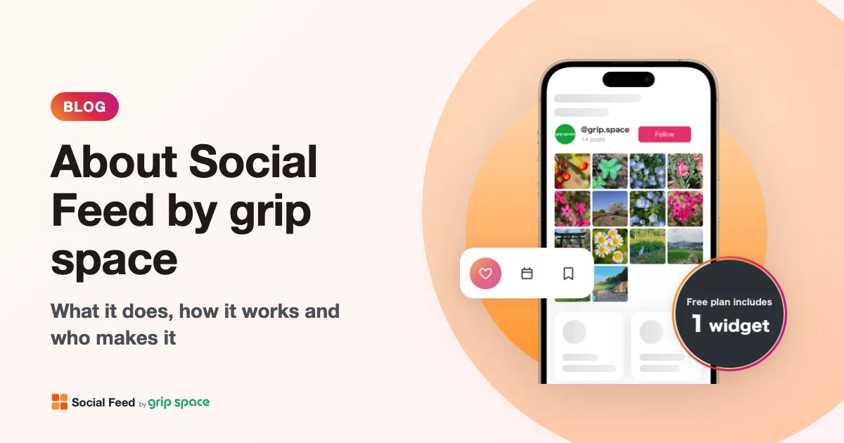
About Social Feed by grip space: what it does, how it works and who makes it
Social Feed by grip space shows your Instagram posts on your website with one embed code. What it does, how it connects to Instagram, its plans, and the company behind it.
Read the article →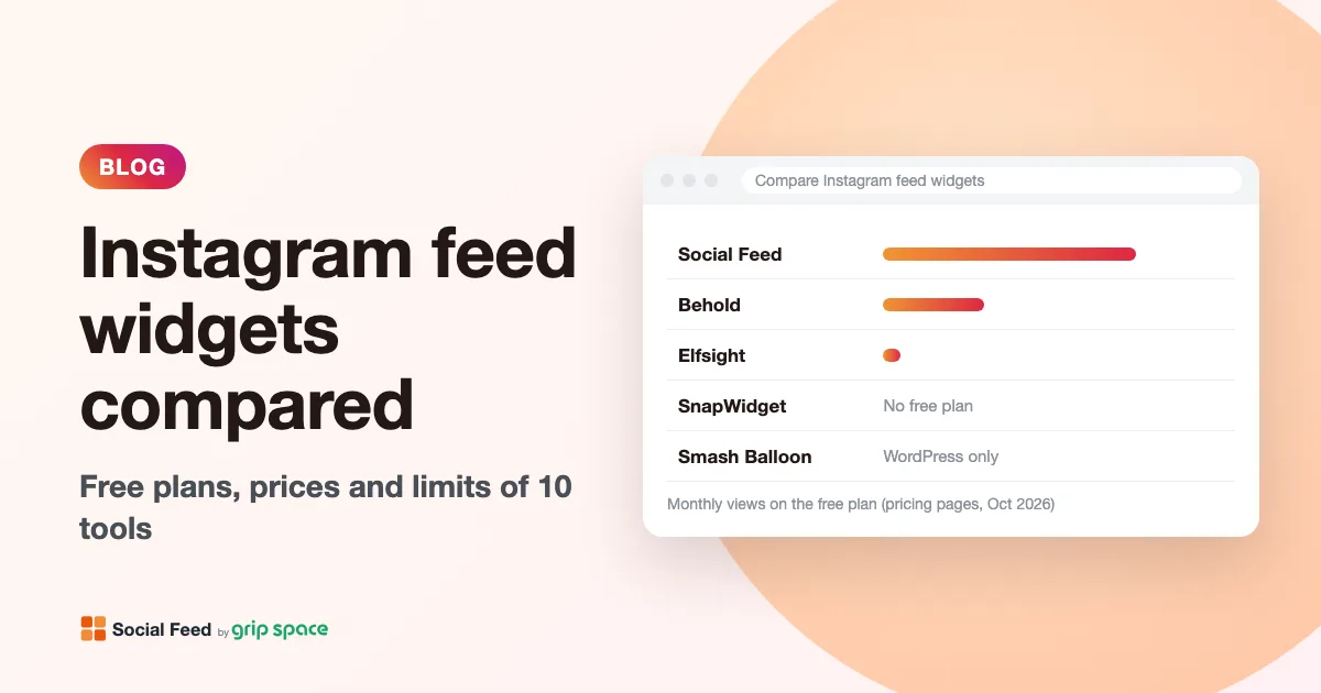
Instagram feed widgets compared: Social Feed, Behold, Elfsight, SnapWidget and Smash Balloon
Free plans, prices, view limits and update speed of five ways to embed your Instagram feed on a website, checked on each pricing page in October 2026.
Read the article →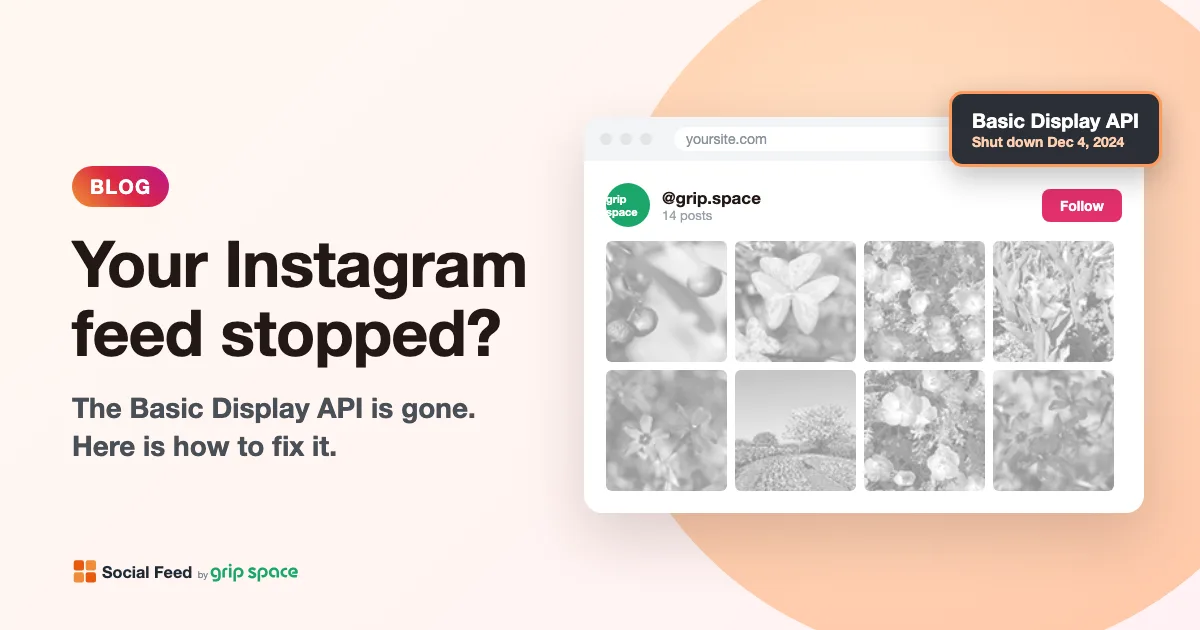
The Instagram Basic Display API is gone: how to keep your Instagram feed on your website
Meta shut down the Instagram Basic Display API on December 4, 2024, and many website feeds stopped working. What changed, how to tell if your feed is affected, and how to fix it.
Read the article →
Why you need an Instagram professional account to show your feed on your website (and how to switch)
Since December 2024, website feeds can only show posts from Instagram professional accounts. What a professional account is, Business vs Creator, and how to switch for free.
Read the article →