
Instagram feed design: how to make the widget match your website
An Instagram feed that looks pasted on makes a careful website look careless. This guide goes through every design setting in Social Feed by grip space, explains which parts of the widget take their look from your site automatically and which parts stay fixed, and gives setting combinations for common site styles. Everything here is something you can actually change in the dashboard; where something cannot be changed, we say so.
Updated October 12, 2026
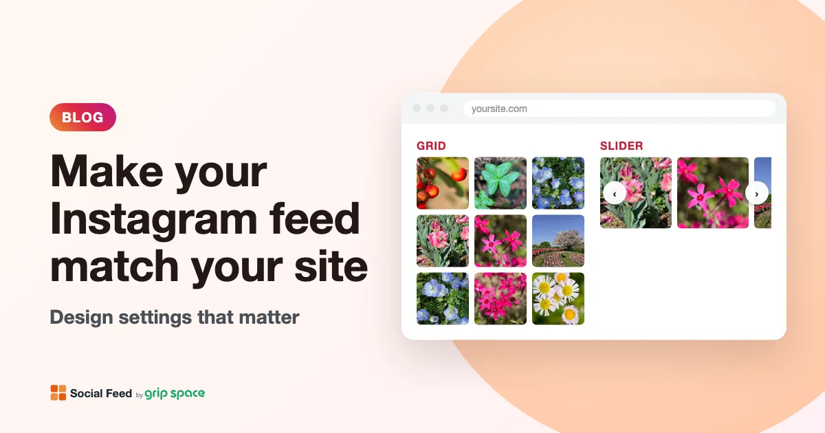
What “matching your website” really means
Most of a feed’s look comes from your photos, and you control those on Instagram, not on your website. What the widget controls is everything around the photos: how wide the feed is, how far apart the images sit, how many fit in a row, what the text above the feed looks like, and what happens when someone points at or clicks a post.
A feed feels like part of the page when those details follow the same rules as the rest of your site. If your site uses generous white space, the feed should too. If your buttons are dark blue, a bright pink follow button will look borrowed. If your content column is 900 pixels wide, a feed that stretches to 1,500 pixels will break the line.
Every design setting at a glance
All of these are in the widget’s “Settings & preview” screen. Changes appear in the preview immediately and on your site after you save, without changing the embed code.
| Setting | Range or options | Default | What it changes |
|---|---|---|---|
| Layout | Grid or slider | Grid | Rows that wrap, or one row that scrolls sideways |
| Columns | 1 to 8 | 4 | The most tiles per row; fewer are used automatically in narrow spaces |
| Number of posts | 1 to your plan’s limit (16, 30 or 50) | 16 | How many tiles appear |
| Image spacing | 0 to 40 px | 4 px | The gap between tiles, both across and down |
| Widget width | 0 to 2,000 px | 1,500 px | The maximum width of the whole widget; 0 means no maximum |
| Font size | 10 to 24 px | 14 px | The text in the account header above the feed |
| Show account info | On or off | On | The header with your profile picture, username, post count and follow button |
| Elements to show | Profile picture, username, post count | All three | Which items appear in the header |
| Follow button text | Any text | “Follow” | The label on the button |
| Button color | Any color | Pink (#e1306c) | The background of the follow button |
| Icon on hover | Show or none | Show | A dark overlay with an Instagram icon and like and comment counts when the pointer is over a tile |
| On click | Open lightbox, open Instagram, do nothing | Open lightbox | What a click on a tile does |
| Show in lightbox | Caption, like count | Both | The text shown with the enlarged post |
On the Free plan a small “Powered by Social Feed” credit always appears below the feed. On the Light and Standard plans you can turn it off, which gives the cleanest result if the feed should look fully native to your site.
What the widget takes from your site automatically
The widget is added directly to your page by a script, not inside an iframe. That has one useful consequence for design: properties that CSS passes down from parent elements reach the widget too.
- Your font. The widget does not set a font family of its own, and font-family is an inherited CSS property. The username, post count and follow button therefore use the same typeface as the section of your page they sit in. If your site uses a brand font, the feed header uses it as well, with no setting needed. The lightbox is attached to the page body, so it uses your site’s base font.
- Your background. The widget has no background color of its own. Whatever color or image the surrounding section has shows through the gaps between tiles and behind the header.
- The width of the space you put it in. The widget is never wider than its container. On a narrow page or in a sidebar it simply uses the space available, and it reduces the number of columns when tiles would get smaller than about 100 pixels.
What stays fixed
Some parts of the design cannot be changed. It is better to know this before you plan a look around them.
- Tile shape. Tiles are always square, with slightly rounded corners (4 pixels). Portrait and landscape photos are cropped to the center of the square. The lightbox shows the whole image.
- Header text colors. The username is dark gray and bold; the post count is a lighter gray. There is no color setting for them. See the section on dark backgrounds below for what this means in practice.
- Follow button shape and text color. The button has white text and rounded corners. You choose the background color and the label, not the shape or the text color.
- The follow button appears whenever the header is on. You can hide the profile picture, username and post count one by one, but not the button alone. To remove the button, turn off “Show account info”.
- Hover overlay, slider arrows and lightbox. The hover overlay is a semi-transparent black layer with white icons. Slider arrows are white circles. The lightbox is a white panel on a dark backdrop. These have no style settings.
- Alignment. When the widget width is smaller than its container, the widget sits at the left of the container. There is no alignment setting; how to center it is covered below.
- No custom CSS field. The dashboard has no box for your own CSS. The widget sets most of its styles directly on its own elements, so styles in your site’s stylesheet generally do not change its tiles, buttons or header.
Step 1: fit the width to your content column
Width matters more than anything else, because a feed that is wider or narrower than the text around it breaks the vertical lines of the page. Find the width of your main content column first. Most website builders show it in the section or container settings; on a hand-coded site it is the max-width of your content wrapper.
- Feed in a full-width section: set the widget width to the same width as your content column, for example 1,100 or 1,200 pixels, so the feed lines up with the text above and below it. This matters most in full-bleed sections, where the container itself is wider than your text.
- Feed inside a text column: set the width to 0 (no maximum). The feed fills the column, exactly like an image placed in the same column would.
- A deliberately narrower feed: set a smaller width, for example 800 pixels, for a slider in the middle of a long page. Then center it as described next.
Because the widget sits at the left of its container, a narrower feed inside a wide section is left-aligned. In most website builders, the cleanest fix is to put the embed in a column or container that already has the width you want and is centered by the builder. On a site where you edit HTML, you can wrap the embed code in a centered container:
<div style="max-width: 900px; margin: 0 auto;">
  <!-- paste your Social Feed embed code here -->
</div>
Here the wrapper does the centering, and the widget fills the wrapper. Set the widget width to 0 or to the same value as the wrapper so the two do not fight.
For where to paste that code on your platform, see the setup guides for WordPress, Shopify, Wix, Squarespace, Webflow and plain HTML.
Step 2: match the spacing to your site’s rhythm
Look at how your site spaces things that sit side by side: product cards, team photos, blog post thumbnails. Most sites use a small set of gaps again and again, for example 8, 16 and 24 pixels. Using one of those for the image spacing is the single most effective way to make the feed look designed for the page.
| Image spacing | Look | Works well with |
|---|---|---|
| 0 px | One solid mosaic; tiles touch | Bold, photo-led sites; full-bleed sections; a strip of images above the footer |
| 2–6 px | Close to an Instagram profile grid | Most sites; small spaces such as sidebars and footers |
| 8–16 px | Separate cards with clear gaps | Sites with card-based layouts and moderate white space |
| 20–40 px | Airy, gallery-like | Minimal, editorial and luxury sites with lots of white space |
The same spacing is used between columns and between rows. Larger gaps take up width, so with very large spacing the widget may show one column fewer in narrow spaces. If you use 30 or 40 pixels, check the feed on a phone.
Step 3: choose a density that suits the page
Columns and post count together decide how busy the feed looks. Many small tiles feel like a lively mosaic; fewer large tiles feel calmer and let each photo be seen. As a rule of thumb, match the density of other image rows on your site: if your product listings show four items per row, a four-column feed will feel at home.
The widget treats the column count as a maximum and uses fewer columns when the space is narrow, so you do not need a separate setting for phones. On most phones, any setting of three or more columns ends up as about three. For a grid, pick a post count that fills the last row at the column counts your visitors will actually see; 6, 12 and 24 divide evenly by 2, 3 and 6 columns, and 12 and 24 also by 4. Our article on grid versus slider layouts covers columns, post counts and phone behavior in detail, so we will not repeat it here.
Step 4: make the header look like your site
The account header is where design mismatches are most visible, because it contains text and a button, and those are things your site already has a style for.
Decide whether you need a header at all
If the section already has a heading such as “Follow us on Instagram” and a link to your profile, a second header inside the widget is repetition. Turn off “Show account info” and let your own heading do the job. If the feed is on its own, keep the header so visitors know whose posts they are looking at and can follow the account.
When you keep it, you can show any combination of profile picture, username and post count. A common clean combination is profile picture plus username, without the post count. On a small widget in a footer, the username alone can be enough.
Set the font size relative to your body text
The font size setting applies to the header. The username is shown at that size, and the post count and the follow button text are a little smaller (about 85 percent of it). To blend in, set the font size to the size of your site’s body text, usually 15 to 18 pixels on modern sites. If you want the username to read like a small subheading, go one or two pixels above your body text. Going much larger makes the header compete with your real headings.
Write the button label in your site’s voice
The default label is “Follow”, and it switches to the Japanese equivalent automatically on pages whose language is set to Japanese. Once you type your own label, it is shown exactly as you wrote it on every page. Short labels work best because the button sits in one line with the account details. Examples that fit different tones: “Follow us”, “Follow on Instagram”, “See more on Instagram”, or the account handle itself.
Pick a button color from your palette, and check its contrast
Use your site’s main button or accent color, so the follow button looks like your other calls to action. The button text is always white, so the background must be dark enough for white text to be readable.
The W3C’s accessibility guidelines (WCAG 2.2, success criterion 1.4.3) ask for a contrast ratio of at least 4.5:1 for normal-size text. The follow button text is small, so the 4.5:1 level applies. A few examples, calculated with the WCAG formula for white text on each color:
| Button color | Contrast with white text | Meets 4.5:1? |
|---|---|---|
| #e1306c (default pink) | About 4.3:1 | Just below |
| #c13584 (darker magenta) | About 5.1:1 | Yes |
| #2563eb (medium blue) | About 5.2:1 | Yes |
| #16a34a (medium green) | About 3.3:1 | No |
| #f59e0b (amber) | About 2.2:1 | No |
| #1f2933 (near black) | About 14.8:1 | Yes |
If your brand color is light, such as yellow, light green or sky blue, use a darker shade of it for the button, or use your dark text color instead. Any contrast checker that accepts two hex colors will give you the ratio for your own color.
Step 5: treat hover and click as part of the design
The hover effect is a design decision as much as a functional one. With “Icon on hover” set to show, pointing at a tile darkens it and shows an Instagram icon with the number of likes and comments. That signals clearly that the tiles are clickable, and it echoes the look of Instagram itself.
Set it to none if your site’s style is very quiet, or if like counts do not fit the message of the page. Phones have no hover, so this choice only affects visitors using a mouse or trackpad.
The click setting matters too. If you choose “Do nothing” to make the feed purely decorative, turn the hover icon off as well, so tiles do not look clickable when they are not.
Feeds on dark backgrounds
Dark sections need special care, because the header text colors are fixed. The username is dark gray, and on a near-black background it practically disappears; the contrast between the two is close to 1:1. The lighter gray post count stays readable on dark backgrounds.
You have three options:
- Hide the text items. Keep the profile picture and the follow button, and turn off the username (and the post count if you like). The button keeps its white text on your chosen color, which works on any background as long as the button color differs clearly from the section color.
- Turn the header off and write your own heading and profile link in the section above the widget, in your site’s light text color.
- Put the widget on a light panel. If your builder lets you give a column or box its own background, a white or light gray panel inside the dark section gives the header a readable background and frames the feed like a card.
The tiles themselves look good on dark backgrounds; photos often look richer there. A spacing of 4 to 12 pixels lets the dark background show as thin lines between images, which can look very deliberate.
Setting combinations for common site styles
These combinations use only the settings described above. Treat them as starting points, then adjust to your own site’s gaps and colors.
| Site style | Layout and columns | Spacing | Header | Hover and click |
|---|---|---|---|---|
| Clean business site | Grid, 4 columns, 8 or 12 posts | 8 px | Picture and username, font size equal to body text, button in your main brand color | Hover icon on, lightbox |
| Minimal or editorial | Grid, 3 columns, 6 or 9 posts | 24–32 px | Off; use your own heading | Hover none, lightbox with caption |
| Bold, photo-led | Grid, 6 columns, 12 posts, width 0 in a full-width section | 0–2 px | Off | Hover icon on, open Instagram |
| Instagram-like profile | Grid, 3 columns, 12 posts | 2–4 px | All three items, button in Instagram-like pink or your accent color | Hover icon on, lightbox with caption and likes |
| Compact footer strip | Slider or one-row grid, 6–8 columns | 2–4 px | Off, or username only at a small size | Hover icon on, open Instagram |
| Dark-themed site | Grid or slider, 4 columns | 4–12 px | Picture and button only, button in a color that stands out from the background | Hover icon on, lightbox |
Where on the page each of these belongs is a separate question; our article on where to put an Instagram feed on your website goes through the common placements one by one.
Keeping several feeds consistent
Design settings belong to a widget. If you paste the same embed code on several pages, the feed looks the same everywhere. If you need a variation, for example a grid on the homepage and a slider in the footer, create a second widget. The “Duplicate” button creates a new widget with the same settings, so you only change what should differ and the rest stays consistent.
Check the design on the live page
The preview in the dashboard is shown at actual size, with the real width, columns and spacing. It cannot show your site’s font, background or surrounding content, so always finish on the published page.
- Open the page on a computer and check that the feed lines up with the content above and below it.
- Compare the gaps between tiles with the gaps between other images on the page.
- Check that the header text is readable on the section background, and that the follow button looks like your other buttons.
- Open the page on a phone. Check the number of columns, the tile size and whether the header fits on one line.
- Point at a tile and click it, to see the hover effect and the lightbox in context.
Troubleshooting design problems
The feed is narrower than the section and sits on the left. The widget width is smaller than the container, and the widget is left-aligned. Raise the width, set it to 0, or center a wrapper as shown in step 1.
The follow button label shows in the wrong language. The default label follows the language of the page. If you want a fixed label, type your own text into the follow button text field; it is then shown as written.
Tiles look tiny. The space is narrow and the spacing is large. Reduce the spacing, or give the feed a wider column. The widget already reduces the column count when tiles would be smaller than about 100 pixels.
My changes do not appear on the site. Make sure you saved the settings and reload the page. If the feed does not appear at all, our guide to an Instagram feed not showing on your website walks through the usual causes.
Frequently asked questions
Does design affect page speed? Hardly. Spacing, width, font size and colors do not change what is loaded. The number of posts and the layout do; the grid or slider article explains how each layout loads images.
New to Social Feed? Read what Social Feed by grip space is, compare the plans, or create a free account and try these settings with your own posts. Questions about a design? Write to us at info@grip-space.co.jp.
Sources
- W3C, “Understanding Success Criterion 1.4.3: Contrast (Minimum)” (WCAG 2.2): https://www.w3.org/WAI/WCAG22/Understanding/contrast-minimum.html
- MDN Web Docs, “Inheritance”: https://developer.mozilla.org/en-US/docs/Web/CSS/Guides/Cascade/Inheritance
- MDN Web Docs, “font-family”: https://developer.mozilla.org/en-US/docs/Web/CSS/Reference/Properties/font-family
Get your embed code in a few minutes. The Free plan needs no credit card.
Sign up freeMore articles
Does an Instagram feed on your website help SEO? An honest answer
What Google can and cannot see in an Instagram feed widget, why it adds little direct SEO value, and what to do instead if search traffic matters.
Read the article →
Instagram feed for hair and beauty salon websites: a portfolio that updates itself
Turn your salon’s Instagram into a website portfolio: feeds per stylist and service, caption tags that work as filters, and setups for booking pages.
Read the article →
Adding an Instagram feed to a hotel or B&B website
How hotels, inns and B&Bs can use an Instagram feed: a homepage slider, feeds per room type, area and events, and several feeds on one page.
Read the article →
Instagram feed for real estate agent websites: keep sold listings off your page
How real estate agents can add an Instagram feed that stays current: hide sold listings, show open houses and tour Reels, and give each area page its own feed.
Read the article →
Instagram feed for gym and fitness studio websites: classes, coaches and Reels
How gyms and fitness studios can use an Instagram feed: class Reels under the schedule, a feed per coach, recent posts only, and no expired promos.
Read the article →
Should photographers add an Instagram feed to their portfolio website?
An honest guide for photographers: what an Instagram feed adds to a portfolio site, how tiles crop your images, what the lightbox shows, and where it fits.
Read the article →