
Where to put an Instagram feed on your website: placements that make sense
An Instagram feed can make a website feel alive, or it can push your most important content out of sight. The difference is mostly where you put it. This guide walks through eight common placements, what each one is good for, what can go wrong, and which settings to use, plus a few spots to avoid and how placement affects page speed.
Updated October 12, 2026
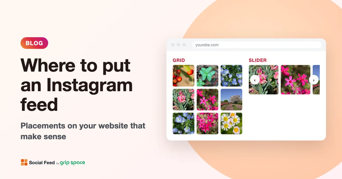
The short answer
Put the feed where a visitor has already understood what you offer and wants proof that you are real, active and worth following. That usually means lower on the page, after your main message and your main button, not above them. Here is a quick overview of the eight placements covered below:
| Placement | Good for | Watch out for | Fit |
|---|---|---|---|
| Homepage, lower section | Showing that you are active; first impression of your style | Pushing the main call to action down | Strong |
| Footer on every page | Steady, low-key presence across the site | Making every page longer and heavier | Good if kept small |
| About page | Showing the people, place and personality behind the business | Few, if the posts match the story | Strong |
| Contact or location page | Showing what the place looks like before a visit | Distracting from the address, map and form | Good below the essentials |
| Product or service page | Real-world photos of that product or service | Competing with price and the buy button | Good with a filtered feed |
| Blog sidebar or end of article | Gaining followers from readers | Very narrow sidebars; repeating on every post | Moderate |
| Thank-you page | Turning a finished action into a follow | Very little | Underused, worth trying |
| Campaign landing page | Social proof for a specific campaign | Links that lead visitors away from the form | Only with care |
Three questions to ask before you choose a spot
- What is this page’s job? Every page has one main thing you want a visitor to do: book, buy, call, read, sign up. A feed should support that job, not compete with it. If the feed’s only effect on a page is to send people to Instagram before they act, it is in the wrong place.
- Where is the visitor in their decision? Someone on your homepage is still forming an impression, so recent photos help. Someone on a checkout page has already decided, so anything that pulls them away is a risk. Someone on a thank-you page has finished, so this is a good moment to invite them to follow you.
- How much room is there? A full-width section, a half-width column and a 300-pixel sidebar call for different layouts. The feed adapts its columns to the width of the space it sits in, but very narrow spaces still show only one or two images per row.
It also helps to remember how the feed is added. With Social Feed by grip space, the embed code is a single script tag, and the feed appears exactly where you paste it. You can paste the same code in several places, or create separate widgets with their own settings for different pages.
<script type="text/javascript" src="https://n246.grip.space/api/v1/instagram/widget/xxxxxxxx"></script>1. Homepage: a lower section, not the hero
The homepage is the most common place for a feed. It is where new visitors decide whether you look trustworthy and current, and a row or two of recent posts shows at a glance that the business is active.
Where on the homepage: after your main message, the key services or products, and the main call to action. A common pattern is to put the feed just above the footer, or between a testimonials section and a final call to action. The top of the page, the “hero” area that visitors see first, should stay focused on what you do and what to click next.
Settings that work well: a grid with 4 to 6 columns and 8 to 12 posts, so the section is one or two rows on a computer. Turn on the account header with your profile picture, username and a follow button, so the purpose of the section is clear.
Watch out for: a tall grid placed early on the page. Every row of images adds height, and on a phone a 12-post grid in three columns is four rows of tiles. Anything placed below the feed moves further down. If you want more posts on the homepage, a slider keeps the section one tile high. For the trade-offs, see grid or slider.
2. Footer: small and site-wide
A feed in the footer appears on every page, so visitors see it wherever they end their visit.
Why it works: the footer is where visitors look for contact details, social links and other “next step” information. A strip of recent posts fits that role naturally. It is also far down the page, so it does not delay or push around your main content.
Settings that work well: a single row. Either use a slider, or a grid where the number of posts equals the number of columns (for example 6 posts in 6 columns). Keep the spacing small and consider turning the account header off or keeping only the follow button, since the footer is already crowded.
Watch out for: weight. Because the footer is on every page, the feed loads on every page too. A grid loads its first row right away and the rest lazily as visitors scroll near them; a slider loads all its images right away. Keep a footer slider short, around 8 to 12 posts. Also check pages where a site-wide feed makes no sense, such as a checkout or a legal page; many site builders let you hide a footer section on specific pages, so check your platform’s options.
To place the code once for the whole site, see the guides for WordPress, Shopify, Wix, Squarespace, Webflow and plain HTML.
3. About page: the people and the place
The About page is where visitors go to find out who is behind a business. Text can tell them; photos can show them. If your Instagram includes your team, your workshop, your store, your events or your work in progress, the About page is one of the most natural homes for a feed.
Where on the page: after your story and before the contact or call-to-action section at the end. A feed placed after a paragraph about how you work gives that paragraph visual proof.
Settings that work well: a grid with 3 or 4 columns and 6 to 12 posts. Set clicks to open the lightbox with the caption shown, because on an About page the story behind each photo matters. If your account mixes product shots with team photos, the caption keyword filter can show only posts that contain words or hashtags such as “#team” or “behind the scenes”.
Watch out for: mismatch. If your About page talks about craftsmanship and the feed below it is all sale announcements, the feed works against the page. Filter, or choose another placement.
4. Contact or location page: below the essentials
For businesses people visit in person, a contact page feed answers a quiet question: what is it actually like there?
Where on the page: after the address, opening hours, map, phone number and contact form. These essentials are why the visitor came, and they must stay at the top. The feed belongs below them as supporting material.
Settings that work well: a slider or a short grid of 6 posts. Clicks can open the lightbox so visitors do not leave the page they need. If you post pictures of your storefront, interior or neighborhood with a consistent hashtag, a keyword filter can show just those.
Watch out for: any feed placed between the visitor and the form. Contact forms are a conversion point, and anything above them that is more fun to click is a distraction.
5. Product or service pages: a filtered feed
Real-life photos of a product, or examples of a finished service, are persuasive where someone is deciding, as long as they are relevant to that page.
Where on the page: below the description, specifications and the add-to-cart or booking button. Visitors who scroll that far are looking for more reassurance, which is exactly what photos of the product in use provide.
Settings that work well: a slider with 4 or 5 columns and 10 to 16 posts, so it takes little vertical space. Use the caption keyword filter set to “Only matching posts” with the hashtag or name you use for that product line, for example “#linenshirt, linen shirt”. Set clicks to the lightbox, not to Instagram, so shoppers stay on the product page.
Watch out for: two things. First, the feed shows posts from your own account only; it does not collect posts other people have tagged you in. If you want customer photos, repost them on your account with a consistent hashtag. Second, filter settings belong to the widget, so different product lines need different widgets. The Free plan includes one widget, the Light plan three, and the Standard plan an unlimited number (see pricing).
6. Blog: sidebar or end of article
Blog readers have just spent time with your content, which makes the blog a reasonable place to invite them to follow you.
Sidebar: sidebars are usually 250 to 350 pixels wide, enough for two or three columns. Six posts in a 2- or 3-column grid make a tidy block. Keep the follow button on, because gaining followers is the main reason for this placement. Note that on phones, most themes move the sidebar below the article or hide it, so check what your theme does.
End of article: a feed after the last paragraph, next to “share this post” buttons or an author box, reaches readers at the natural end of their visit. A single-row slider works well here. If you write a single article about one project, consider embedding a single Instagram post instead of a whole feed.
Watch out for: repetition. A sidebar feed plus a footer feed means the same photos twice on every blog page. Pick one.
7. Thank-you page: the overlooked spot
After someone submits a form, books a table, signs up for a newsletter or completes an order, most websites show a short “thank you” message and nothing else. Yet this is a moment when the visitor has finished what they came to do and is open to a next step. Following you on Instagram is a light, low-commitment next step.
Settings that work well: a compact grid of 6 posts with the account header and a follow button whose text says what they will get, for example “Follow for new arrivals” or “Follow for event photos”. You can change the follow button text and color in the widget settings. Here, setting clicks to open Instagram directly makes sense, because there is nothing left on the page for the visitor to do.
Watch out for: platforms where the thank-you page is not a normal page you can edit. Some form tools and checkout systems show a fixed message or restrict scripts on their confirmation screens. Check what your platform allows; if you cannot add code there, you may be able to redirect to a thank-you page on your own site instead.
8. Campaign landing pages: only with care
A landing page built for an ad or campaign usually has one goal and as few distractions as possible. Every link that leads elsewhere, including to Instagram, is a way out before the visitor acts.
When it can help: when Instagram activity is the proof the page needs, for example a launch where your posts show the product in use, or an event page where photos from last year’s event show what to expect.
How to do it: put the feed below the form or main button, never above. Set clicks to open the lightbox rather than Instagram, so visitors can look at posts without leaving. Use a keyword filter for the campaign hashtag, and the date range filter (last 30 or 90 days) so only recent, relevant posts appear. When the campaign is over, switch the widget to Unpublished in the dashboard; the embed code then shows nothing, so you do not need to edit the page.
Places to avoid
- Above your main headline or call to action. Visitors should understand what you do before they see your latest posts. A feed at the very top also affects page speed metrics more, as explained below.
- Inside checkout, payment or sign-up flows. Anything that invites a visitor to leave in the middle of a purchase or registration is a risk.
- In pop-ups and overlays. A feed inside a pop-up is cramped, and visitors who close the pop-up never see it.
- Twice on the same page. A homepage section plus a footer feed shows the same photos twice. If you want both, filter them differently or remove the footer feed on that page.
- As the only place for important information. Opening hours, prices and booking details belong in your page’s text. Captions appear only in the lightbox, and many visitors never open a post.
How placement affects page speed: CLS and LCP
Google’s Core Web Vitals include two metrics that placement can influence. Google’s web.dev site describes both, and both are measured at the 75th percentile of page loads, separately for mobile and desktop.
| Metric | What it measures | “Good” according to web.dev | How a feed can affect it |
|---|---|---|---|
| Cumulative Layout Shift (CLS) | How much visible content moves unexpectedly while the page is in use | 0.1 or less | The feed is inserted by a script, so content below it can move down when it appears |
| Largest Contentful Paint (LCP) | When the largest image or text block in view finishes rendering | 2.5 seconds or less | If the feed is near the top, a feed image could become the largest element in view |
Layout shift. The feed is added by JavaScript after the page starts to display, and it has no fixed height before it loads, since its height depends on the number of posts, columns and the width available. web.dev notes that embeds often do not know their size before they load, and that injected content closer to the top of the viewport usually causes bigger shifts. Its advice is to reserve space where you can, and if you cannot, to place the content lower on the page. A feed in the lower half of a page or in the footer usually moves nothing the visitor is looking at.
Largest Contentful Paint. LCP looks at elements visible on screen. A feed far down the page is not in view when the page loads, so it is unlikely to be the element LCP measures. A feed at the top could be, and its images come from Instagram’s servers after the script runs, which is later than an image written directly into your page.
If you do need the feed high on a page, you can reserve space for it with a wrapper element and a minimum height. Measure the height of the feed on the live page at a typical width and use a value a little smaller, as web.dev suggests for content whose size varies:
<div style="min-height: 420px">
  <script type="text/javascript" src="https://n246.grip.space/api/v1/instagram/widget/xxxxxxxx"></script>
</div>
Keep in mind that the height differs between phones and computers, because the number of columns changes with the width. If you unpublish the widget, the reserved space stays empty, so remove the minimum height at the same time. For most sites, simply placing the feed lower is the easier fix. Whichever you choose, check the page with PageSpeed Insights before and after adding the feed.
Check every placement on a phone
Most placements look different on a phone. Multi-column sections usually stack into one column, sidebars move or disappear, and a feed that sat next to your text on a computer may end up between your headline and your button on a phone. Before you consider a placement finished:
- Open the live page on a real phone, not only in the site editor. Some editors do not run embedded scripts in the editing view.
- Scroll from the top and note where the feed appears relative to your main button. If the feed now comes first, move it or hide that section on mobile if your platform allows it.
- Check that tiles are large enough to tap. The feed reduces its columns automatically when the space is too narrow for images of about 100 pixels, but in very narrow spaces even one or two columns can look small.
One widget or several?
If you paste the same embed code in several places, the feed looks the same everywhere: same layout, columns, filters and number of posts. That is fine for a footer and a homepage section. But the placements above often call for different settings, such as a slider in the footer, a filtered grid on a product page and a 6-post block on the thank-you page.
Each widget has its own settings and its own embed code, and you can copy the settings of an existing widget when you create a new one. The dashboard also shows a view count for each widget, which tells you roughly how often each placement is loaded, though not how many people clicked. Remember the view allowance per plan: 3,000 views a month on the Free plan, 30,000 on Light and unlimited on Standard. A site-wide footer feed counts a view on every page load, so it uses the allowance much faster than a feed on one page.
A quick placement checklist
- The page’s main message and main button come before the feed, on computers and on phones.
- The posts shown are relevant to the page, using filters if needed.
- Clicks open the lightbox on pages where you want visitors to stay, and Instagram only where following is the goal.
- You have checked page speed and layout movement with PageSpeed Insights.
- The site-wide view count fits your plan’s monthly allowance.
Frequently asked questions
Does an Instagram feed help SEO? Not directly in a way you can count on. The feed is added by a script and its captions are only shown in the lightbox, so do not rely on it for content you want search engines to read. Its main value is for visitors. Keep important text in your page itself.
Can I show a different feed on each page? Yes, by creating a widget for each set of settings. The number of widgets depends on your plan: one on Free, three on Light, unlimited on Standard.
The feed does not appear where I pasted the code. Check that the widget is Published, that your platform does not strip script tags, and that you are looking at the live page. See Instagram feed not showing on your website for a full checklist.
New to Social Feed by grip space? Read what it is and how it works, see how to add a feed without a plugin, or create a free account and try a few placements yourself.
Sources
- Google web.dev, “Cumulative Layout Shift (CLS)”: https://web.dev/articles/cls
- Google web.dev, “Optimize Cumulative Layout Shift”: https://web.dev/articles/optimize-cls
- Google web.dev, “Largest Contentful Paint (LCP)”: https://web.dev/articles/lcp
Get your embed code in a few minutes. The Free plan needs no credit card.
Sign up freeMore articles
Instagram feed for restaurant and café websites: what to show and where
How restaurants and cafés can use an Instagram feed: which posts to show, where to place them, and filter recipes for menus, specials and Reels.
Read the article →
How to add an Instagram feed to a Ghost site
Three ways to show your Instagram posts on a Ghost site: an HTML card, Code Injection, or a theme partial. Which to use, step by step, and what each can’t do.
Read the article →
Free Instagram feed widget: what you get on the free plan (and its limits)
An honest look at the Social Feed by grip space Free plan: 1 widget, 16 posts, 3,000 views a month, daily updates, a credit link, and when to upgrade.
Read the article →
How to add an Instagram feed to your BigCommerce store
Show your Instagram posts on a BigCommerce store with a Page Builder HTML widget, and learn when Script Manager or theme files make sense instead.
Read the article →
How to add an Instagram feed to a GoDaddy website
Add an auto-updating Instagram feed to a GoDaddy Websites + Marketing site with an HTML section, plus tips on iframe height, the lightbox and GoDaddy WordPress.
Read the article →
How to add an Instagram feed in Divi
Show your Instagram posts on a Divi site: paste one embed code into a Code module, or add it to a global footer with the Divi Theme Builder. No plugin needed.
Read the article →