
Avoiding layout shift (CLS) from social media widgets
You start reading a page, and suddenly the text jumps down because a social media feed has appeared above it. That jump is a layout shift, and Google measures it as Cumulative Layout Shift (CLS), one of the Core Web Vitals. This guide explains why widgets cause it, how to measure it on your own page, and how to reserve the right amount of space for an Instagram feed so nothing moves.
Updated October 12, 2026
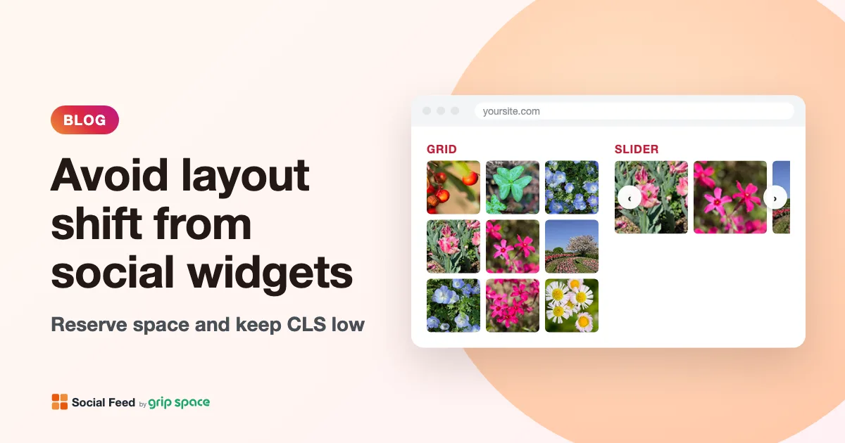
The short answer
Most social media widgets are added by a script. The browser starts displaying your page before the script has run, so at first there is no space for the widget. When it appears, everything below it moves down. If that happens while the visitor can see it, it counts as a layout shift.
There are two fixes, and you can combine them. The first is to place the widget lower on the page, where it appears before the visitor scrolls there. The second is to reserve space for it in advance with a wrapper that has a minimum height. This article covers both, with the exact numbers for the Social Feed by grip space widget.
What CLS measures
web.dev, Google’s site for web performance guidance, defines CLS as a measure of visual stability: how much visible content moves unexpectedly. A few details matter for widgets:
- Each shift gets a score. The score is the impact fraction (how much of the viewport the moving content covers, before and after the move) multiplied by the distance fraction (how far it moves, relative to the viewport). web.dev’s example: content covering 75% of the viewport that moves by 25% of the viewport’s height scores 0.75 × 0.25 = 0.1875.
- Shifts are grouped into bursts. Shifts less than one second apart, within a window of at most five seconds, are added up. CLS is the largest of these bursts during the visit.
- Only unexpected shifts count. Shifts within 500 milliseconds of a click, tap or key press are excluded, because the visitor caused them. A feed appearing on its own during page load is not excluded.
- Only visible content counts. If the content that moves is not in the viewport, its movement does not add to the score. This is why placement matters so much.
web.dev considers a CLS of 0.1 or less good and more than 0.25 poor, measured at the 75th percentile of page loads, separately for phones and computers. By that measure, the shift in the example above alone would be enough to fail.
Why social media widgets shift the page
web.dev’s guide to optimizing CLS points out that embeds often do not reserve space for themselves, and that the site owner may not know the exact size of what will be inserted. Social media widgets are a textbook case, for a few reasons:
- They appear late. The script has to download and run, and the content usually depends on data that is only known at that moment: how many posts there are, how long the captions are, and so on.
- Their height depends on the width. A grid of square images gets taller as the space gets wider, and many widgets change the number of columns on phones.
- Some resize after loading. Widgets inside an iframe often start with a default size and are resized once their content arrives, which is a second shift.
- Images without reserved dimensions. If a widget’s images have no fixed size, each one can push content around as it finishes loading. web.dev’s lazy-loading guidance stresses giving images dimensions for this reason.
How the Social Feed widget behaves
It helps to know exactly which of these apply. Here is how the Social Feed by grip space widget is built:
| Behavior | Effect on layout shift |
|---|---|
| The feed is inserted right after the script tag, as a normal block on the page (no iframe) | One shift when it appears, unless space is reserved |
| Every tile is a fixed square with a light gray background before its image arrives | Images loading in, including lazy-loaded ones, do not move anything |
| The profile picture in the header has a fixed size | The header does not change height when the avatar loads |
| The number of columns is worked out from the actual width before the feed is first shown | The first layout is already the final one in most cases |
| The widget measures again shortly after it appears, and when the window is resized | Small adjustments are possible if the available width changes, for example when a scrollbar appears |
| The lightbox opens as an overlay on top of the page | Does not move the page, and it only opens after a click |
| The slider is always one tile high | Easy to reserve the right height |
In practice, nearly all of the widget’s layout shift comes from one moment: the feed appearing where there was nothing before. That makes it a good candidate for reserving space, because once you know the height, the problem is solved.
Fix 1: Place the feed below the first screen
web.dev notes that content injected closer to the top of the viewport usually causes greater layout shifts, and recommends placing content you cannot reserve space for later on the page. If the feed appears below what the visitor can see when the page loads, it can push content that is also out of view, which does not count.
For most sites this is the simplest fix, and it fits how feeds are usually used anyway: as supporting content after your main message. Our article on where to put an Instagram feed on your website goes through good spots page by page. One caution: “below the first screen” on a computer can be in view on a phone, where sections stack, or the other way around. Check both.
Fix 2: Reserve space with a min-height wrapper
If the feed has to be high on the page, put the embed code inside a wrapper element that already has a minimum height. The browser lays out that empty space from the start, so when the feed appears, it fills the space instead of pushing content down.
<div style="min-height: 480px">
  <script type="text/javascript" src="https://n246.grip.space/api/v1/instagram/widget/xxxxxxxx"></script>
</div>
Use min-height rather than height. With min-height, the wrapper can still grow if the feed is taller than expected, so nothing is cut off. With a fixed height, a taller feed would overflow into the content below it.
web.dev’s advice for content whose size varies is to reserve the smallest size that will be used. If the feed turns out a little taller, there is a small shift instead of a large one. If you reserve too much, the feed never shifts anything, but visitors see a gap of empty space below it. A value slightly below the measured height is a good compromise.
How to work out the right height
The feed’s height is the sum of up to three parts. You can calculate the gallery part, but the simplest and most accurate method is to measure the live feed.
| Part | Height | Shown when |
|---|---|---|
| Account header | At least about 56 px (a 42 px profile picture plus 14 px of space below it); more if the Follow button or text wraps | The account header is turned on |
| Gallery (grid) | rows × tile width + (rows − 1) × image spacing | Always |
| Gallery (slider) | tile width + 8 px | Always |
| Credit line | About 30 px | Always on the free plan; optional on paid plans |
The tile width is the width of the space for the feed, minus the gaps, divided by the number of columns actually shown:
tile width = (feed width − (columns − 1) × image spacing) ÷ columns
rows (grid) = number of posts ÷ columns, rounded up
Remember two things when you use this formula. The feed width is the width of the space it sits in, capped by the “max width” setting. And on narrow spaces the widget shows fewer columns than you set, so that tiles do not get smaller than about 100 pixels.
Two worked examples for a grid with 12 posts, 4 columns and the default 4 px spacing, gallery only:
| Feed width | Columns shown | Tile width | Rows | Gallery height |
|---|---|---|---|---|
| 1000 px (computer) | 4 | (1000 − 12) ÷ 4 = 247 px | 3 | 3 × 247 + 2 × 4 = 749 px |
| 360 px (phone) | 3 | (360 − 8) ÷ 3 ≈ 117 px | 4 | 4 × 117 + 3 × 4 ≈ 481 px |
Notice that the phone layout is much shorter than the computer layout, even though it has more rows. A single min-height value cannot fit both, which is why the next section uses media queries.
To measure instead of calculate:
- Open the live page in Chrome and wait for the feed to appear.
- Right-click the feed and choose Inspect. In the Elements panel, find the element with the class
grip-ig-widget; this is the whole feed, including the header and credit line. - Hover over it or look at the Computed tab to read its height.
- Use the device toolbar in DevTools to switch to a phone width and measure again.
- Use values a little below the measured heights for your min-height.
Different heights for phones and computers
Media queries let you set a different minimum height for different screen widths. web.dev mentions this for placeholders whose size differs between form factors. If your platform lets you add a style element next to the embed code, you can do it like this:
<style>
  .ig-feed-slot { min-height: 520px; }
  @media (min-width: 768px) {
    .ig-feed-slot { min-height: 780px; }
  }
</style>
<div class="ig-feed-slot">
  <script type="text/javascript" src="https://n246.grip.space/api/v1/instagram/widget/xxxxxxxx"></script>
</div>
Replace the numbers with your own measurements, and replace the script tag with the embed code from your dashboard. Two cautions:
- Media queries look at the screen, not the space. A feed in a sidebar or in one column of a two-column section is narrower than the screen. Measure the feed where it actually sits, at a few screen widths around your breakpoints.
- Your breakpoints may differ. If your theme switches from a one-column to a two-column layout at a different width, use that width instead of 768px so the minimum height changes when your layout does.
If your site builder does not allow a style element, the inline min-height from the previous section still helps. Choose the phone value, since it is the smaller one: on a computer the feed will still shift content, but by much less.
Should the reserved space look like something?
web.dev mentions placeholders and skeleton screens as ways to fill reserved space while content loads. For a feed, an empty area is usually fine: it is only empty for a moment, and the feed’s tiles show a light gray background until their images arrive, so the transition looks natural. If you prefer, give the wrapper a subtle background color that matches your section, so the space reads as a deliberate block rather than a gap.
Avoid putting text such as “Loading…” inside the wrapper. The feed is inserted after the script tag, not in place of what is already there, so any placeholder text would stay above the feed after it appears. A background color on the wrapper does not have this problem.
Sliders are easier
A slider is always one tile high, no matter how many posts it contains, so its height depends only on the width and the number of columns shown. With 4 columns and 4 px spacing in a 1000 px space, the gallery is 247 px plus 8 px, about 255 px. In a 360 px space with 3 columns shown, it is about 117 px plus 8 px, about 125 px. Add the header and credit line if you show them.
If the feed must sit near the top of a page, a slider is the layout that is easiest to keep stable. Keep in mind that a slider loads all of its images right away, so keep the number of posts modest. The trade-offs are explained in Grid or slider?
Keep the reserved space in sync with your settings
The reserved height is tied to your feed’s settings. Revisit it when you:
- change the number of posts, the number of columns, the image spacing or the max width;
- switch between grid and slider;
- turn the account header or the credit line on or off;
- move the feed to a different place in your layout;
- change your theme or its breakpoints.
Post filters can matter too. If a filter such as a caption keyword or a period of days leaves fewer posts than your post count, the grid has fewer rows and is shorter than you planned. A minimum height that is a bit too large then leaves a gap below the feed.
Also remember that the wrapper stays on the page even when the feed does not. If you set the widget to Unpublished, or it is not displayed for another reason, the reserved space stays empty. When you take a feed down on purpose, remove the wrapper or its min-height too. Our article on hiding the Instagram feed temporarily covers the options.
How to check for layout shift
Measure before and after you add the wrapper, so you know it is working.
- PageSpeed Insights. Enter your page at pagespeed.web.dev and look at CLS for mobile and desktop. The lab result covers one simulated page load; field data, if your site has enough visitors, covers real visits over the previous 28 days.
- Layout Shift Regions. In Chrome DevTools, open the Rendering tool (under More tools) and turn on Layout Shift Regions, then reload. Areas that shift are briefly highlighted, so you can see whether the content below the feed still moves.
- Performance panel. Record a page load in the Performance panel. Shifts appear in the Layout shifts track; clicking one shows its score and the elements that moved. The panel’s live metrics view also shows the page’s CLS while you interact with it.
web.dev notes that lab tools mostly capture shifts during page load, so lab CLS can be lower than what real visitors experience. Since the feed’s shift happens during load, lab tests are a good way to check this particular problem. Field data is the final word, but it takes weeks to reflect a change.
For overall speed, as opposed to stability, see Will an Instagram feed slow down your website?
Other common causes of layout shift near a feed
If CLS is still high after you reserve space for the feed, the cause may be something else on the page. web.dev’s guide lists several frequent ones:
| Cause | Typical fix |
|---|---|
| Images without width and height | Add width and height attributes, or set an aspect ratio in CSS |
| Ads and other embeds without reserved space | Reserve space with min-height, as for the feed |
| Banners inserted at the top, such as cookie or announcement bars | Reserve space for them or show them as an overlay |
| Web fonts that change the size of text when they load | Follow the font-loading advice in web.dev’s CLS guide |
| Content that is removed after loading | Keep the space; removing reserved space shifts content too |
Troubleshooting
The content below still jumps a little. The feed is taller than your min-height. That is expected if you chose a slightly smaller value; if the jump is noticeable, measure again and raise the value a bit.
There is a gap below the feed. Your min-height is larger than the feed. Check whether filters or a smaller post count made the feed shorter, and measure again.
Fine on a computer, jumps on a phone. You are probably using one value for all widths. Add a media query with a phone value.
My site builder removes the style element. Use the inline style on the wrapper, or add the class rule through your theme’s custom CSS setting, if it has one.
The feed does not appear at all inside the wrapper. The wrapper does not affect the script. See Instagram feed not showing on your website for the usual causes.
Frequently asked questions
Does layout shift affect Google rankings? CLS is one of Google’s Core Web Vitals, and PageSpeed Insights reports it alongside loading and responsiveness. Whatever its weight in search, a page that does not jump is better for visitors. Our article Does an Instagram feed help SEO? covers the search side.
Do lazy-loaded feed images cause shifts as I scroll? Not with this widget. Each tile already has its final square size before its image loads, so images fill the tile instead of resizing it.
Does opening the lightbox count? No. It opens on top of the page after a click, and shifts right after a click are excluded from CLS anyway.
Can I use CSS aspect-ratio on the wrapper instead? aspect-ratio works well for content with a fixed shape, such as a slider without header and credit line. A grid that changes its number of columns and has a header above it does not keep one ratio, so min-height with media queries is more reliable.
Do I need to do this if the feed is at the bottom of the page? Usually not. If the feed is out of view when it appears, the movement it causes does not count. Check with PageSpeed Insights to be sure, especially on short pages where the bottom is visible right away.
Set it up
If you have not added a feed yet, you can start for free and follow the guide for your platform: WordPress, Shopify, Wix, Squarespace, Webflow or plain HTML. Wherever you paste the embed code, paste the wrapper around it at the same time. Plan details are in the pricing section.
Sources
- web.dev, “Cumulative Layout Shift (CLS)”: https://web.dev/articles/cls
- web.dev, “Optimize Cumulative Layout Shift”: https://web.dev/articles/optimize-cls
- web.dev, “Debug layout shifts”: https://web.dev/articles/debug-layout-shifts
- web.dev, “Browser-level image lazy loading for the web”: https://web.dev/articles/browser-level-image-lazy-loading
- Google for Developers, “About PageSpeed Insights”: https://developers.google.com/speed/docs/insights/v5/about
- MDN, “aspect-ratio”: https://developer.mozilla.org/en-US/docs/Web/CSS/aspect-ratio
Get your embed code in a few minutes. The Free plan needs no credit card.
Sign up freeMore articles
How to lazy load an Instagram feed on your website (and what our widget already does)
How native lazy loading works for Instagram feed images, which images Social Feed loads right away and which wait, and how to check it in your browser.
Read the article →
Where to place a third-party widget script: head or body, async or defer?
Head or body, async or defer: how browsers run a widget script, why an in-place widget must sit where it renders, and what tag managers and optimizers break.
Read the article →
Content Security Policy and Instagram feed widgets: what to allow
The exact CSP directives an Instagram feed widget needs: script-src, img-src, media-src and style-src, plus how to find blocked hosts and test safely.
Read the article →
How to add alt text to Instagram posts (and why it matters on your website)
How to write and edit alt text on Instagram, what makes a good description, and what happens to it when your posts appear on your website.
Read the article →
Making social media embeds on your website more accessible
A practical WCAG checklist for social media embeds: images, keyboard, focus, motion, video and contrast, plus an honest look at what our feed widget does and doesn’t do.
Read the article →
Core Web Vitals and third-party embeds: a practical guide for small sites
How social feeds, videos and other embeds affect LCP, INP and CLS, how to measure the impact on a small site, and practical fixes that don’t need a developer.
Read the article →